The two main colours selected for the logo of my label are canary yellow and violet. After many revisions, we finally selected a yellow possessing depth without being too bright. The quest for the perfect violet was another story. My first point of reference was the Pantone book, familiar to graphic designers, artists and anyone in the printing industry.
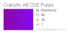
After much frustration over trying out several 'violet' colours the infamous Pantone book had to offer, I decided a standard stock colour wasn't the way to go. After all this label represents the colours of the rainbow, the brilliance shining out from the sun, as if we would go with a standard colour! I was pointed in the direction of a brilliant website, my logo saviour =) The vast array of colours on offer was like a being a little girl in a lolly store, heaven! Check out www.colourlovers.com. I started off liking the first colour story below featuring the violet purple, then I came across the winner!
Color by COLOURlovers
Color by COLOURlovers